Carrier

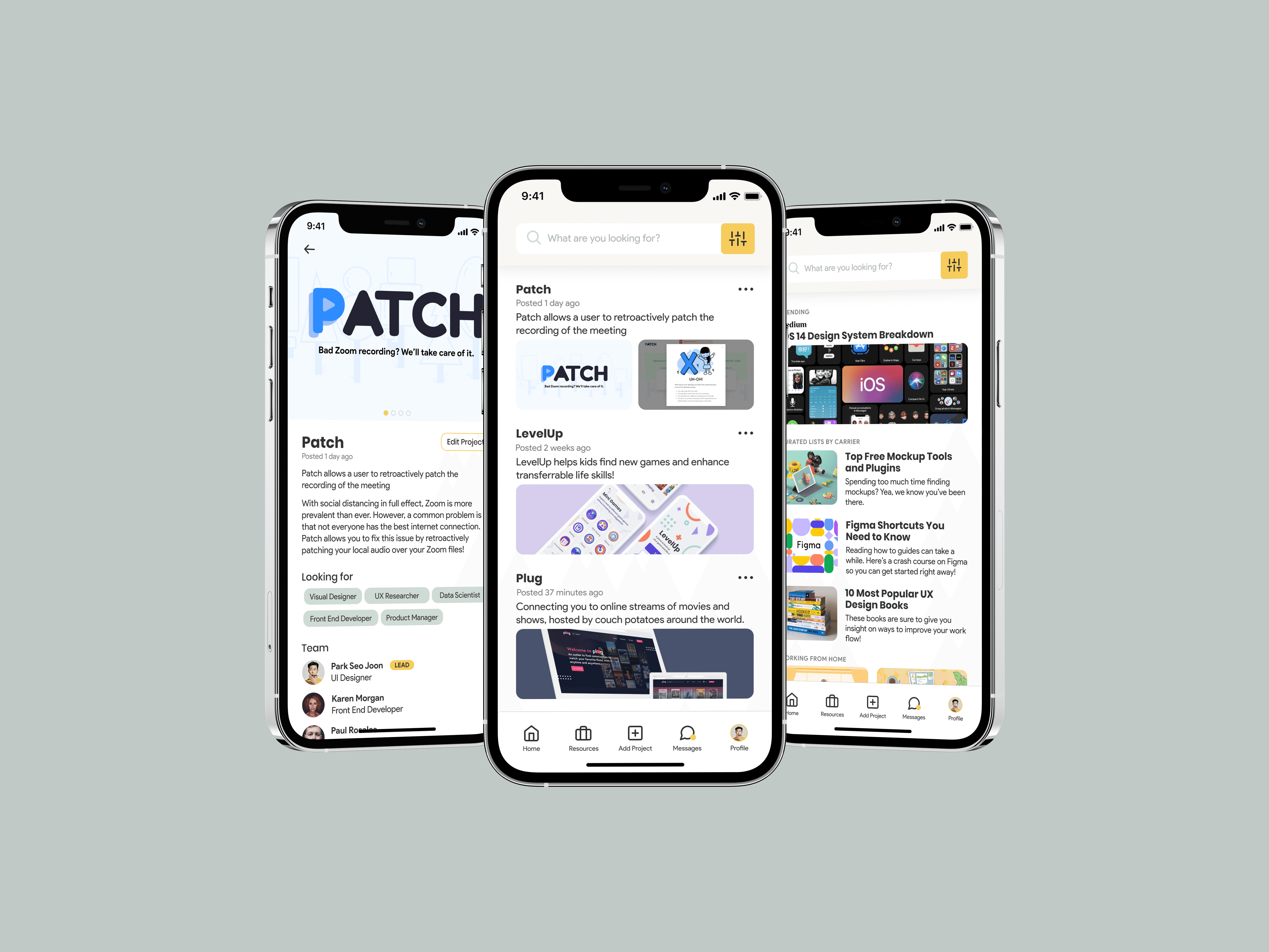
Creating a talent-searching app that helps opportunity-seeking students find skilled collaborators and projects to work on.

Context

Context

Context

A mobile-first experience that makes it easier for students to find side projects and collaborators. Designed for a 24-hour design-a-thon, which my team and I placed Top 8 nationwide in.

Role

Role

Role

User Interface, User Experience, Prototyping, User Research, Design Systems

Values

Values

Values

Education and Accessibility

PROBLEM

PROBLEM

How can students collaborate with one another on projects in this remote-first world?

How can students collaborate with one another on projects in this remote-first world?

How can students collaborate with one another on projects in this remote-first world?

The Coronavirus has either taken many student's internships away or reduced the chances of them getting one. To combat their loss, many students have taken the initiative to do their own side projects, participate in community initiatives, start their own business, and so on.

The Coronavirus has either taken many student's internships away or reduced the chances of them getting one. To combat their loss, many students have taken the initiative to do their own side projects, participate in community initiatives, start their own business, and so on.

USER RESEARCH & INSIGHTS

Understanding the full picture of the problem space

Understanding the full picture of the problem space

Understanding the full picture of the problem space

To understand the problem space, my team and I conducted semi-structured interviews with college students to gain insight on how they look for projects to work on and/or find people to work with. From our insights, we identified pain points that we needed to address:

01

Inconvenient for students to hop between different applications to find and communicate with project mates

02

Difficult to find projects and people to work with on existing social networking applications

IDEATION
Familiarizing ourselves with students' workflow, the product, and the market.

Familiarizing ourselves with students' workflow, the product, and the market.

Familiarizing ourselves with students' workflow, the product, and the market.

Competitive Analysis

Competitive Analysis

Competitive Analysis

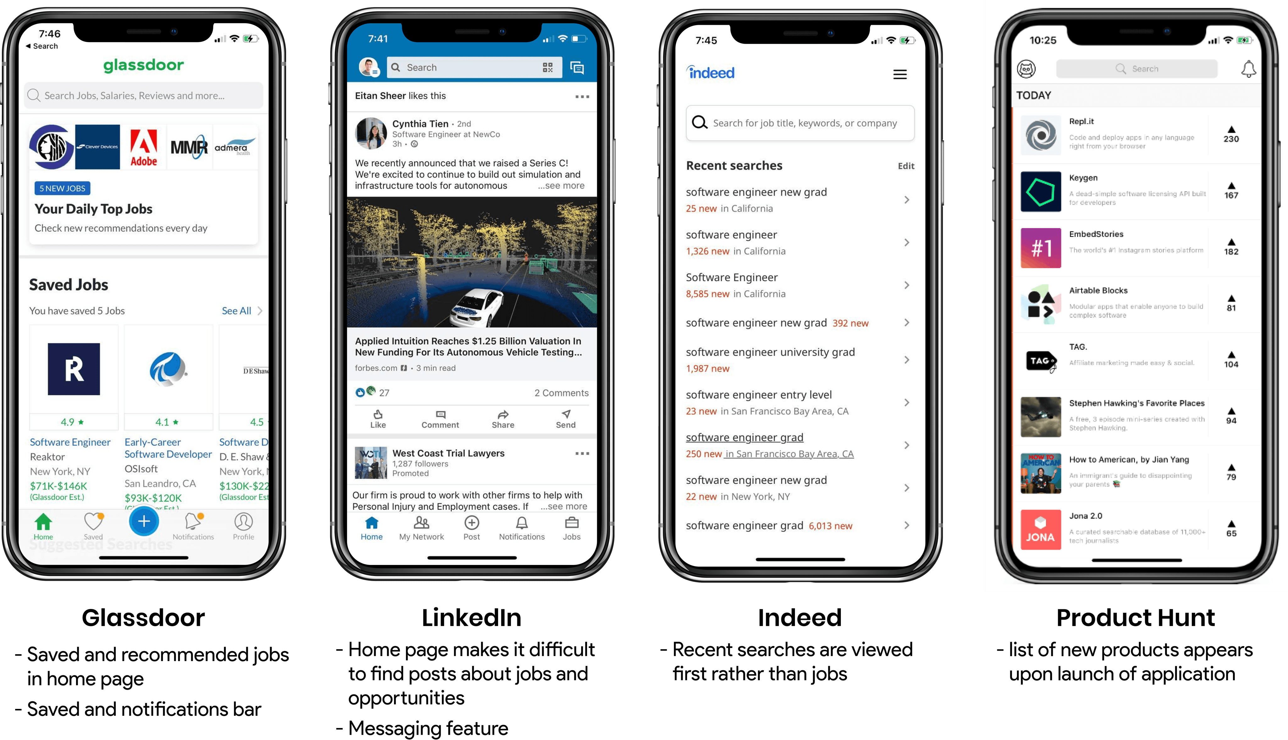
We turned to popular social networking apps and similar products to understand the existing solutions in the problem space.
Information Architecture

Information Architecture

Information Architecture

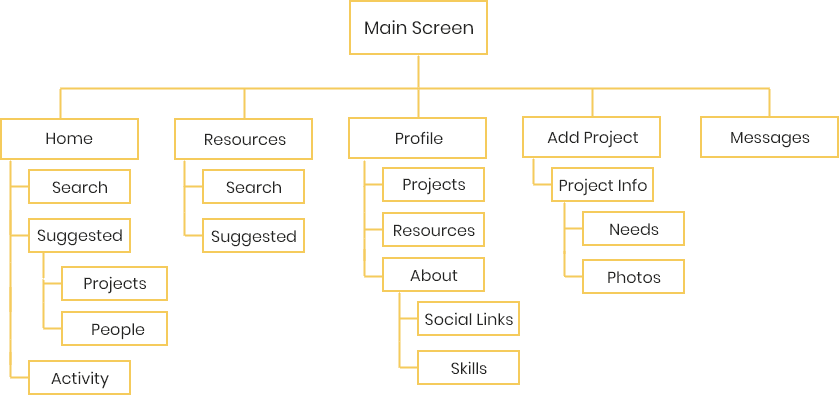
Taking our user research and competitive analysis into account, we created a site map to visualize how users would be navigating through out app.

WIREFRAMING & ITERATING

Designing and iterating how it flows and feels

Designing and iterating how it flows and feels

Designing and iterating how it flows and feels

Because this had to be done within 24 hours, we didn’t have the time to ask for user feedback or validation. Instead we scheduled critique sessions with each other, which revealed that our screens were cluttered, designed in a way that drew attention away from projects, which is not what we wanted, and provided extraneous information that further hindered the project searching process.

Because this had to be done within 24 hours, we didn’t have the time to ask for user feedback or validation. Instead we scheduled critique sessions with each other, which revealed that our screens were cluttered, designed in a way that drew attention away from projects, which is not what we wanted, and provided extraneous information that further hindered the project searching process.

INITIAL SOLUTION

The final product after 24 hours

I’m super proud that my team and I were able to accomplish this within 24 hours but upon second look, there were a few things that I realized that needed improvement. I felt like some screens didn’t provide the most useful app experience which in turn made our app a little unfocused and drawn away from the initial design requirement, which was to find a way to find projects to work on and people to work with.

INITIAL SOLUTION

INITIAL SOLUTION

The final product after 24 hours

The final product after 24 hours

I’m super proud that my team and I were able to accomplish this within 24 hours but upon second look, there were a few things that I realized that needed improvement. I felt like some screens didn’t provide the most useful app experience which in turn made our app a little unfocused and drawn away from the initial design requirement, which was to find a way to find projects to work on and people to work with.

REDESIGNED SOLUTION

Going back to the drawing board

Going back to the drawing board

Going back to the drawing board

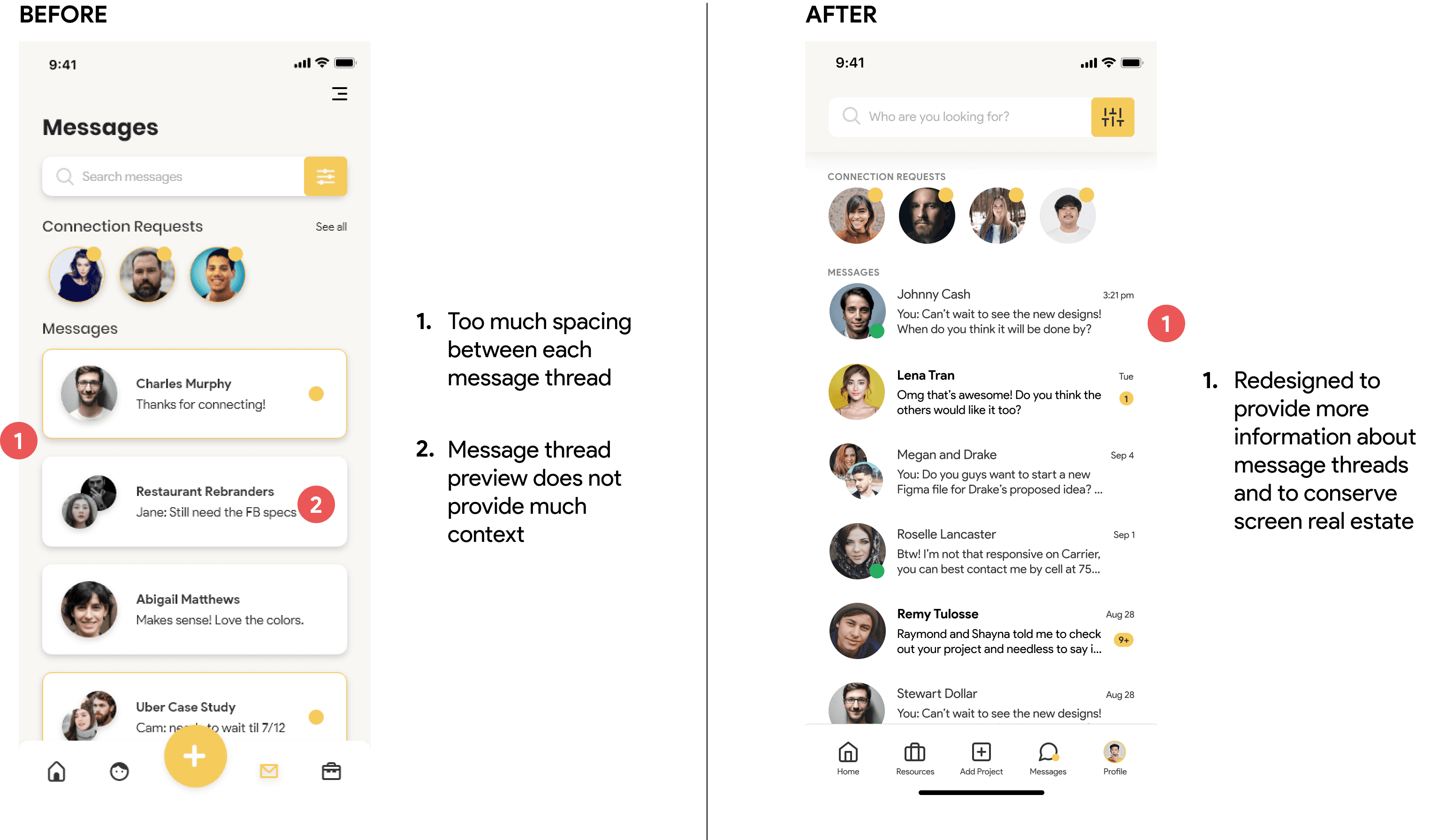
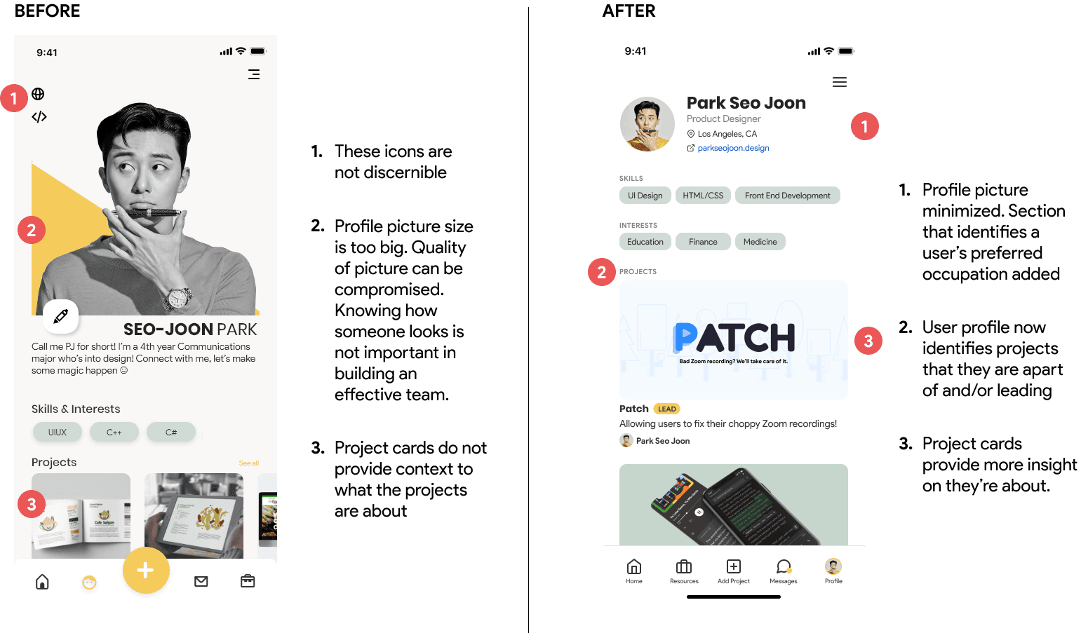
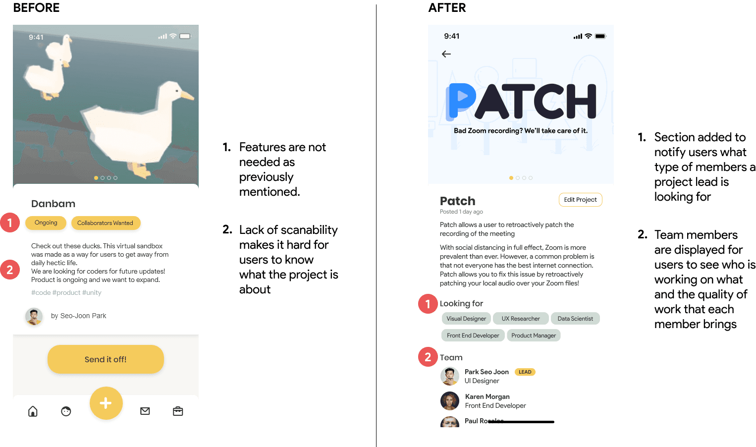
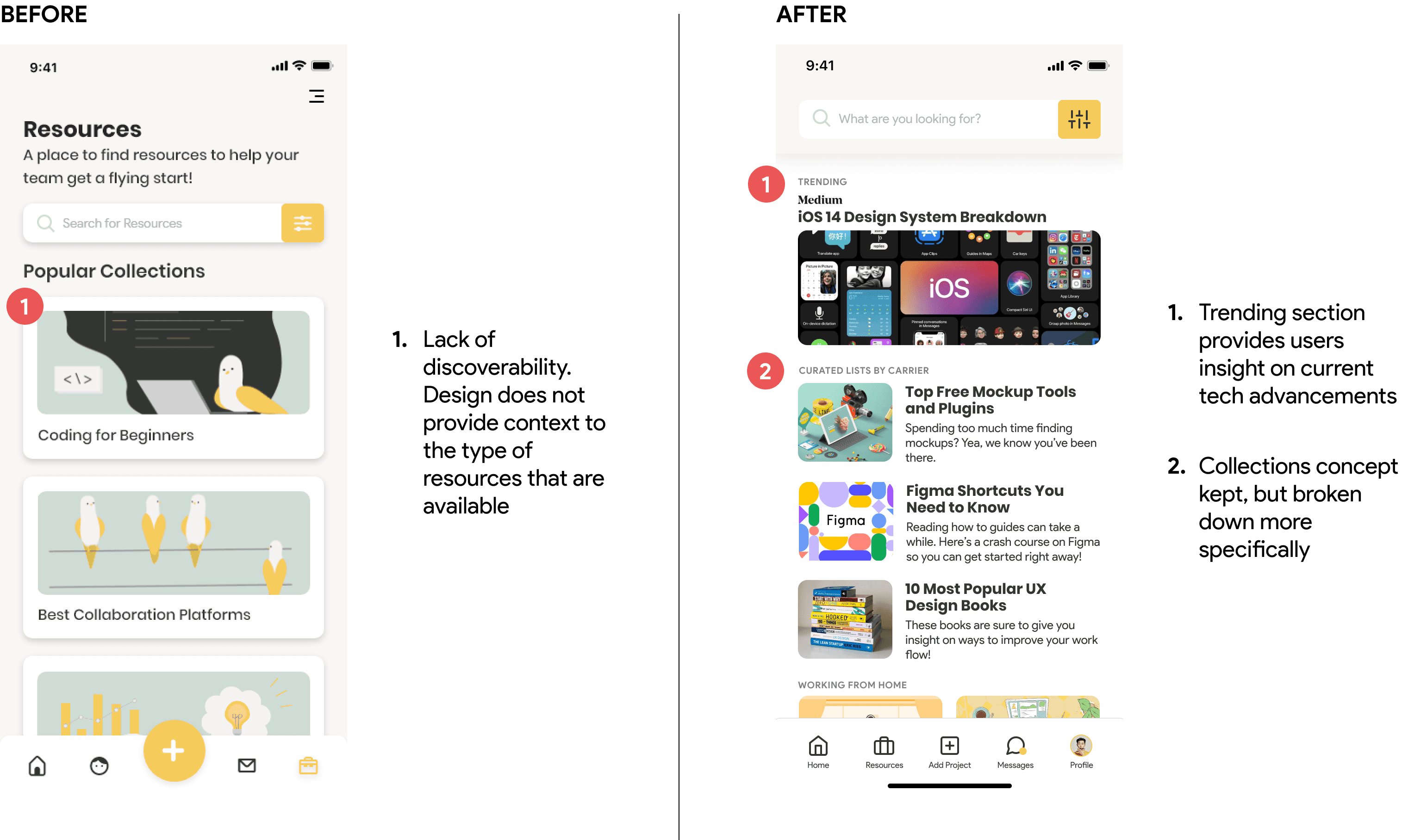
I decided to spend some time (post design-a-thon) doing some polishing. I went back to the market and user research and really tried to understand the problem space better and ensured that I continuously looked back at my design requirements to make sure I didn’t add any unnecessary features that drew attention away from the main goal.

Add Project

Add Project

Add Project

Redesigned to allow users to add more information about their project and to be more explicit with who they're looking for to join their team.

REDESIGN DETAILS
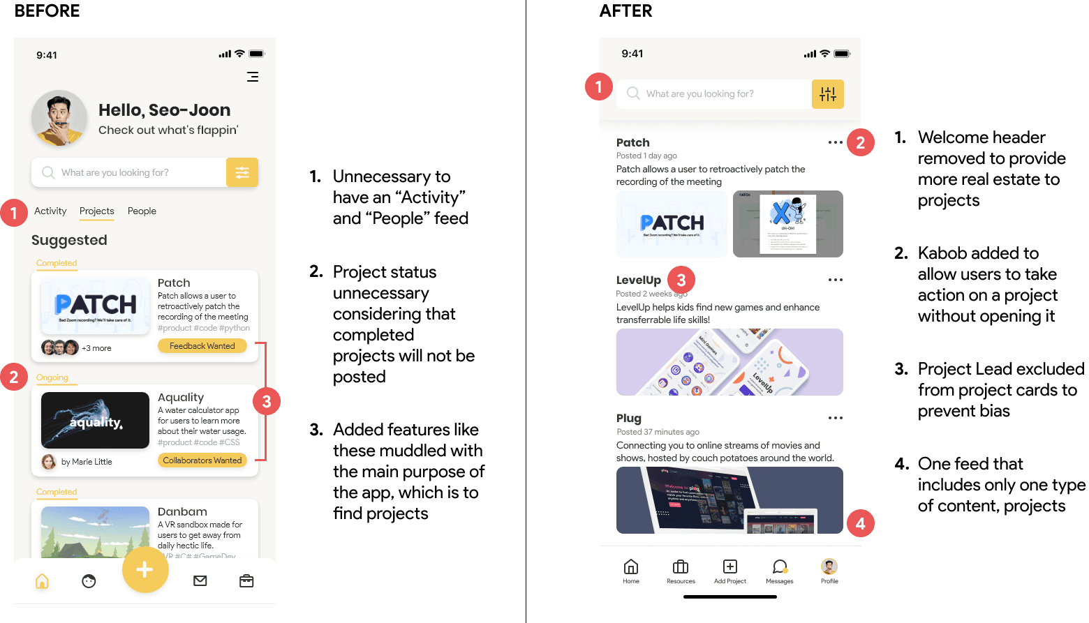
A breakdown of the changes I made

A breakdown of the changes I made

A breakdown of the changes I made