Dawn Health
Improving the activation experience to reinforce program goals and encourage app retention
I led design with a small team of 2 engineers and 1 sleep therapist to redesign the activation experience. The redesign improved the onboarding experience and streamlined user journeys.
Lead Designer, Product Direction, User Interface, User Experience, Prototyping
Education and Accessibility
RESPONSIBILITIES
Dawn is an early-stage health startup that uses Cognitive Behavioral Therapy to treat people with insomnia. Being the only designer, I had to manage content strategy, lead product direction, and work cross functionally to complete and launch end-to-end experiences. Without a project manager on our team, I also had to lead meetings to get buy-in on which areas of the app we should focus on next. Despite the lack of resourcing, I was able to launch an entire redesign of the app while managing the company's website and creating advertising solutions. To me, this activation experience milestone was the hardest but most enjoyable experience to work on throughout the app overhaul.
PROBLEM
The activation period is a 4 day period where users are slowly introduced to the app and learn about its features. Throughout these 4 days, features unlock as users complete certain tasks. With what's currently implemented, users are not able to understand the value of Dawn, what there is to do for the first 4 days of using it, and the benefit of completing 4 days of tasks. We want to redesign the activation experience so that we can reinforce the value of Dawn and make it easy for users to understand the expectations during these 4 days and in turn sell them into using the app for longer than their free 7-day trial.
DESIGN REQUIREMENTS
The Dawn app was still in beta at the time, so we did not have substantial quantitative data to help guide us towards a certain direction. We took a qualitative approach using feedback emails sent by users and set these goals for the redesign:
01
Improve the onboarding experience to better explain goals and expectations
02
Clarify confusion as to why and when features unlock and why data is changing
DESIGN AUDIT
The previous app version was designed by a design agency. You can view all of the old app screens here. By auditing the app, I identified 3 things I wanted to improve with the redesign:
Content Hierarchy - to help users understand what to focus on
Visual Design - to bring more delight to the user experience
User Experience - to make flows easier to understand
In addition to revamping the existing UI, the team also wanted to incorporate new flows that better reflect in-person sleep therapy sessions. A lot of design critiques and iterations had to be done to achieve the flow, language, and practice of in-person sleep therapy as close as we could.
SOLUTION
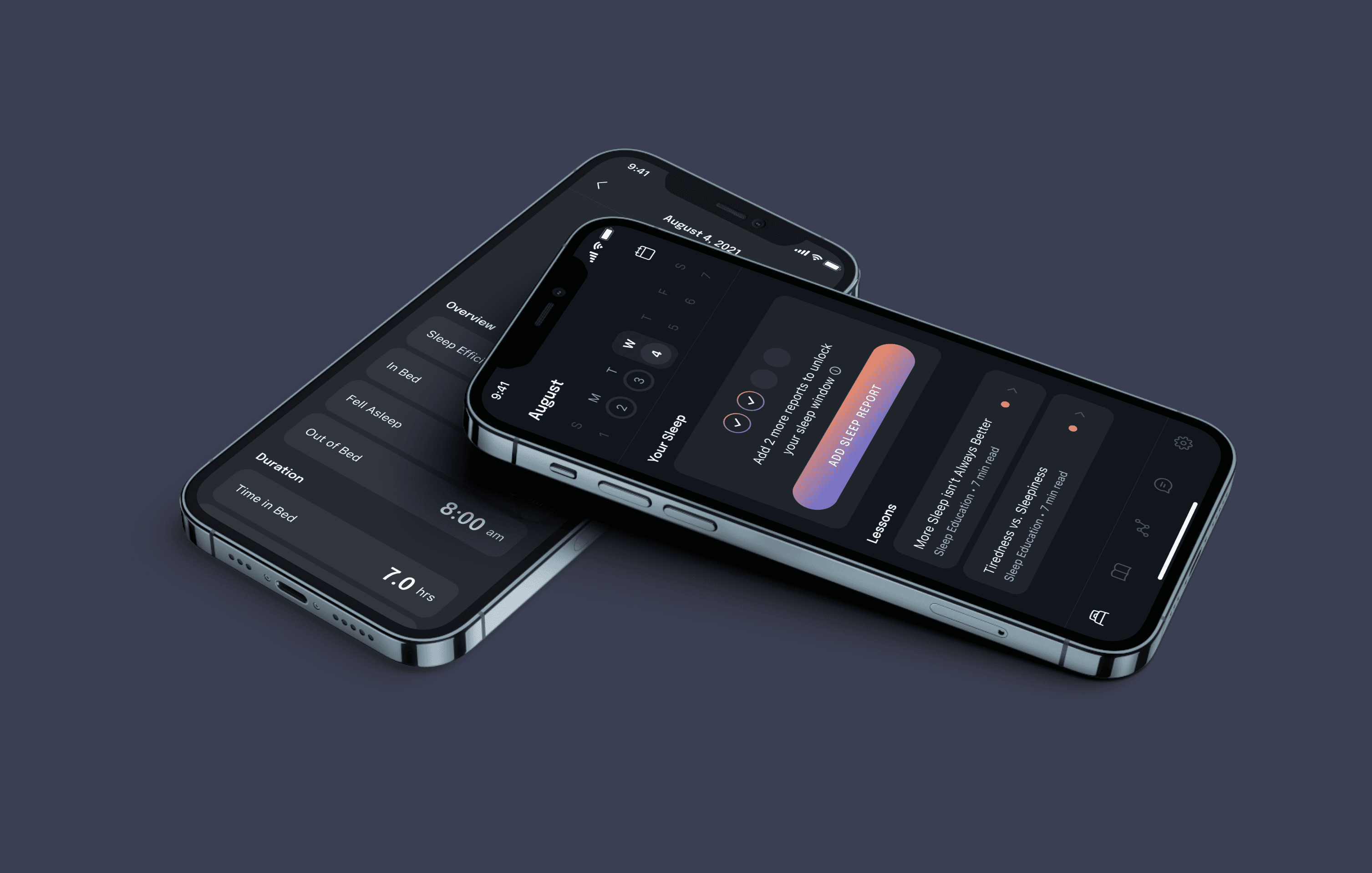
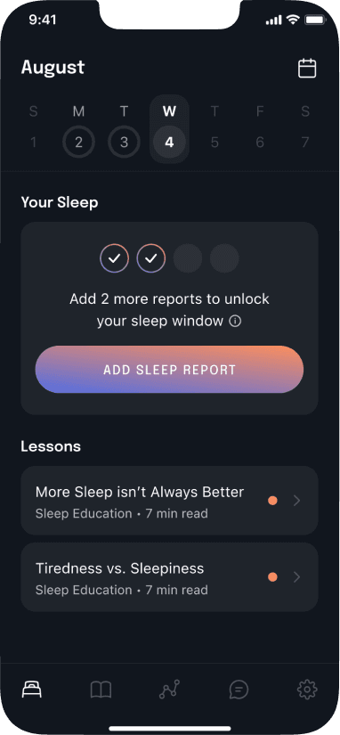
The final design of this milestone includes a redesign home tab, which combines and simplifies the functionality of the old home and sleep tab, improved user reporting flows, and a calendar feature to help retain users. You can see this version live on the app store — Dawn Health.


Redesigned to provide a smoother data entry experience and a place for users to describe their sleep to their therapist in detail.
RESULTS
As a small startup, we didn't have the infrastructure in place to do proper quantitative testing. Instead, I set up an email marketing campaign on Intercom to collect feedback on all aspects of the app. With the launch of the new home screen, we saw a decrease in emails asking for clarification on how to use the app and great feedback from users.
“The design and user experience is absolutely great. It looks amazing and is super easy to use. Simple and minimal. I don’t understand why it took a random Reddit post for me to find it ;-) Guess I’m quite early, although your app looks nothing like a simple MVP. It’s rock solid.”
“Dawn's design, copy, and marketing is great. I have to sincerely really compliment you there!”
“The overall signup process was easy and good”
CONCLUSION
It was great to see that the new version of the activation experience was well received. If I had the chance to revisit this milestone with the proper resources, I’d be interested in seeing metrics on how many of our users successfully made it past the activation period and how long it took for users to get past the activation period before and after the new version. With these metrics, I can see how effective implementing the new features were or validate whether adding them made a huge difference.
This milestone made me obsessed with reading user feedback. Despite the difficulties in creating this new experience, I had the most fun working on this milestone during my tenure at Dawn.


