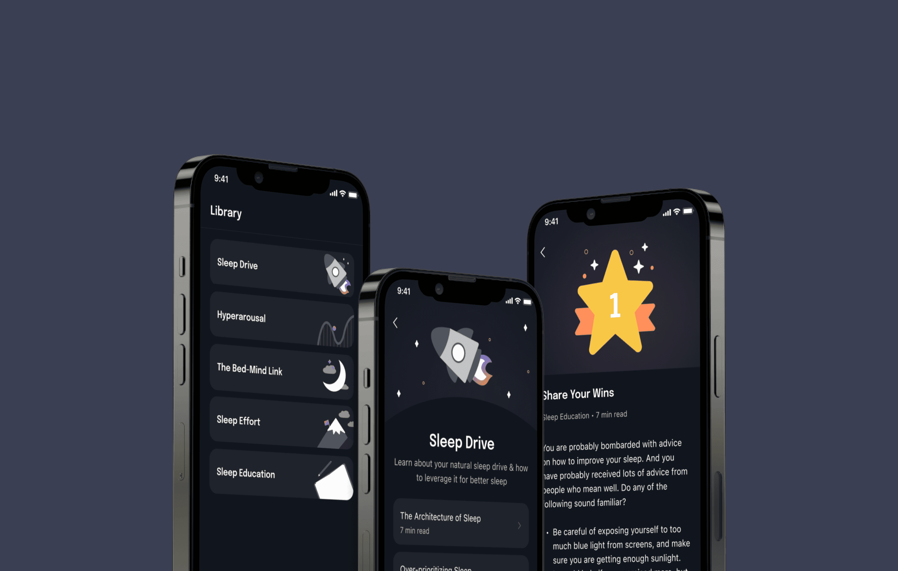
I redesigned the entire library experience, making it easier for users to find content, and improved the user interface by creating all of the graphics. I later returned to this milestone to create concept work that improves content digestion and searching.
Lead Designer, User Interface, User Experience, Prototyping, Graphic Design, Illustration
Education and Accessibility
PROBLEM
Users who are following the Dawn program are allotted 2-3 lessons a day and cannot and are not recommended to read future lessons. The main thing about CBT for insomnia is we want users to not think or ruminate too much on their sleep. Overthinking is what actually causes the difficulty of falling asleep in the first place.
Because of the limited amount of lessons being allocated a day, many users mistaken the library tab to only have those handful of lessons. This makes users assume that there isn’t much content, questioning the legitimacy of the program. Furthermore, the current library tab doesn't do a good job at making information easy to find.
DESIGN REQUIREMENTS
The team and I had a meeting to discuss the details of our product requirements. Since the team wanted this to be shipped quickly, I had planned to heavily rely on already existing components. Due to time constraints, no new features were to be created in this pass. Our priorities for this milestone were:
01
Improve the library experience and its scalability to make it easier to find lessons
02
Design a way for users to see future lessons without giving them access to them
DESIGN AUDIT
The previous app version was designed by a design agency. By auditing the app, I identified 3 things I wanted to improve with the redesign:
Scalability - to lower maintenance cost and better user experience
Visual Design - to bring more delight to the user experience
Clarity - to make searching for information easier
SOLUTION
I approached this redesign with a very simple vision – I wanted to create something that was easy to implement and add some fun that the previous version didn’t have. The most time consuming part of this milestone was creating the graphics, but the payoff was great. Using existing components made these pages very easy to build too. You can see this version live on the app store — Dawn Health.
Adding categories helps with both the scalability and searchability issue that was apparent in the initial design. Instead of dumping all of the lessons on one page, we can now allocate them to different categories.
The previous font used was Epilogue which is a very fun looking font, but it isn’t fun to read font. I decided to just have the engineers use the default OS font, SF Pro for iOS and Roboto for Android.
NEXT STEPS
When I had a little free time, I actually revisited this milestone to create a few concepts that I think could help amp the library experience even more.
CONCEPT WORK
With the help of the search bar, users will be able to find lessons according to their title or their content, making it easy for users to revisit lessons quicker.
CONCEPT WORK
Many users made comments about having another way to digest content. I created a simple audio lesson tool that allows users to do just that.
CONCLUSION
This milestone taught me how to work with time constraints and lack of resources. I also wanted to showcase this portfolio piece to highlight my graphic design, prototyping, and product direction skills.
The team was very receptive to the concept works I created but I didn’t push them further since there was no time in the engineering roadmap soon to implement these.
Creating a space that makes learning easier and less intimidating is something I’m really passionate about so I couldn’t help but create these early explorations.


